FRUIT NUKES
LEVIATHAN PROJECT
FULL BRAND BUILD
Year
2019-2020

FRUIT NUKES WAS Company that LEviathan was building up to compete with older companies in the exploding target business.
Mind you this product's main purpose was for target indication when practicing with your firearm. Really a huge way to blow some $$$, so the brand really needed to be fun and entertaining!


BRANDING
FRUIT NUKES
STEP 1
RESEARCH
THE FIRST STEP IN BRANDING SHOULD ALWAYS BE TARGET RESEARCH AND COMPETITION RESEARCH.


Sonic Boom
Best Marketing in the competition

Tannerite
The Most Well Known and longest lasting Explosive company in the industry. Comparable to kleenex

Exploding Targets
First Company on google search for Exploding Targets
Quite Crazy How Similar they are!
STEP 2
CONCEPT
AFTER RESEARCHING ALL AVENUES FOR THE MARKET ALONG WITH ALL THE COMPETITION YOU ARE ABLE TO FIND. WE BEGAN THE CONCEPT PHASE OF THE BRAND.


MOOD BOARD


Landing SPot

FUN
PLAYFUL
SAFE
EXCITING
THe Nuke tail wings of a bomb were the slight modification to the pineapple form
Pineapple was a term for Grenades Back in the day
These Colors weren't doing it for me
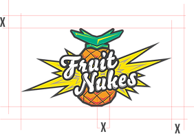
STEP 3
BRAND COLORS
Going back to the Market and Competition Research, The Competition mostly used a vibrant construction/warning ORange. We wanted something with more pop, flare, and Fun!


FINAL COLOR SCHEME
STEP 4
BUILDING BRAND KIT
Once we had landed on the final logos and colors it was then time to build the FN brand to be exactly what we needed.


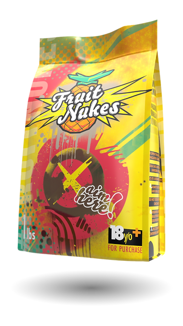
PACKAGING
LOOKING at the competition everyone was using plastic containers such as pre work-out containers. Orginally that is what we thought we would use as well.
Supplements Are similar containers. They also have to fight for real estate on shelves in the store. The idea was for Fruit Nukes to pop off the shelves against the competition in sporting goods stores.
 Solid White |  Orange Plastic |  Clear Plastic To See The Chemicals |
|---|

GHOST was an example of what we wanted to accomplish. (created by Super Top Secret)


This was the First Mockup for PAckaging
Everyone was very pleased with this.
As the project went on I decided to present an idea to our CEO.
P1
SAFETY
POTENTIAL SHRAPNEL
ENVIRONMENT
P2
SHIPPING
LOTS OF WASTED SPACE
P3
STORAGE
PLASTIC TAKES Up SPACE
PROBLEMS
3 PACKAGING ISSUES
There were three major PACKAGING ISSUES With Containers THAT PRESENTED THEMSELVES TO ME ONCE THE PROJECT WAS UNDERWAY.

At the time, the three problems arrose I had just finished a package design for EDC CoffEE Company.
Coffee Pouch?
They Pack well together, they fold up for storage, less likely to cause harm to the environment, or shrapnel. Full Print.

The math worked out and fixed every problem we faced.
CONTENT
I KNEW WE WOULD BE ABLE TO CAPTURE THE TRUE VIBE AND FEELING OF THE FRUIT NUKES. LIFESTYLE PHOTOGRAPHY AT THE RANGE.
OUR TEAM SAT DOWN AND CREATED A SHOT LIST, PLANNED THE DATE AND WE SET OUT FOR A FUN DAY AT THE RANGE.
TOP SHOTS


WEBSITE

AT THIS POINT I HAD PUT TOGETHER THE WHOLE BRAND, PACKAGING AND LIFESTYLE VIBE.
IT WAS TIME TO BUILD THE WEBSITE, I PASSED OFF THE TORCH TO OUR GRAPHIC DESIGNER AND GAVE GUIDANCE ALONG THE WAY.

FRUIT NUKES
LEVIATHAN PROJECT
FULL BRAND BUILD
Year
2019-2020
This Whole Process was stressful and super fun all at the same time. Having some creative freedom on this, let my team and I to really create something awesome and fun!


